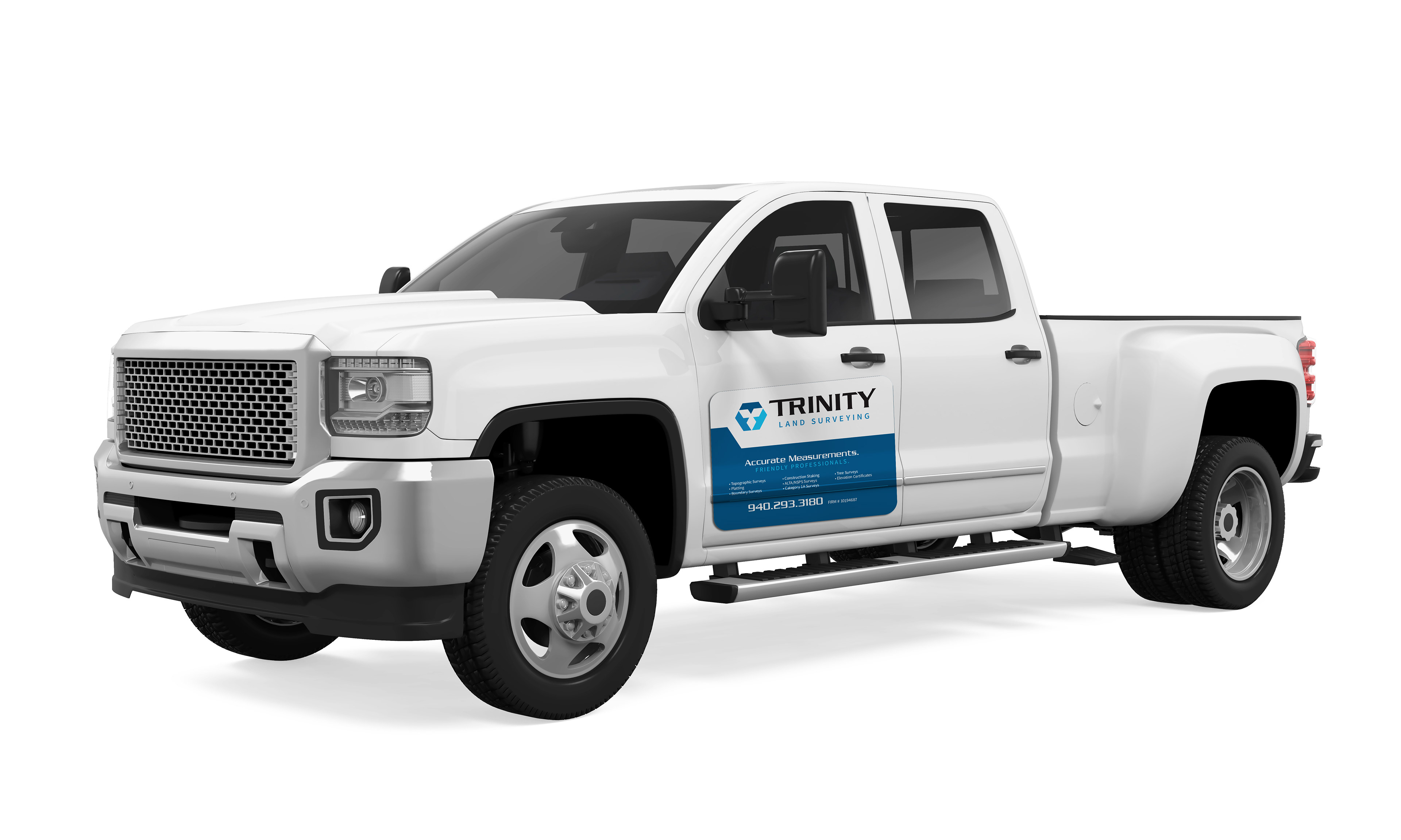
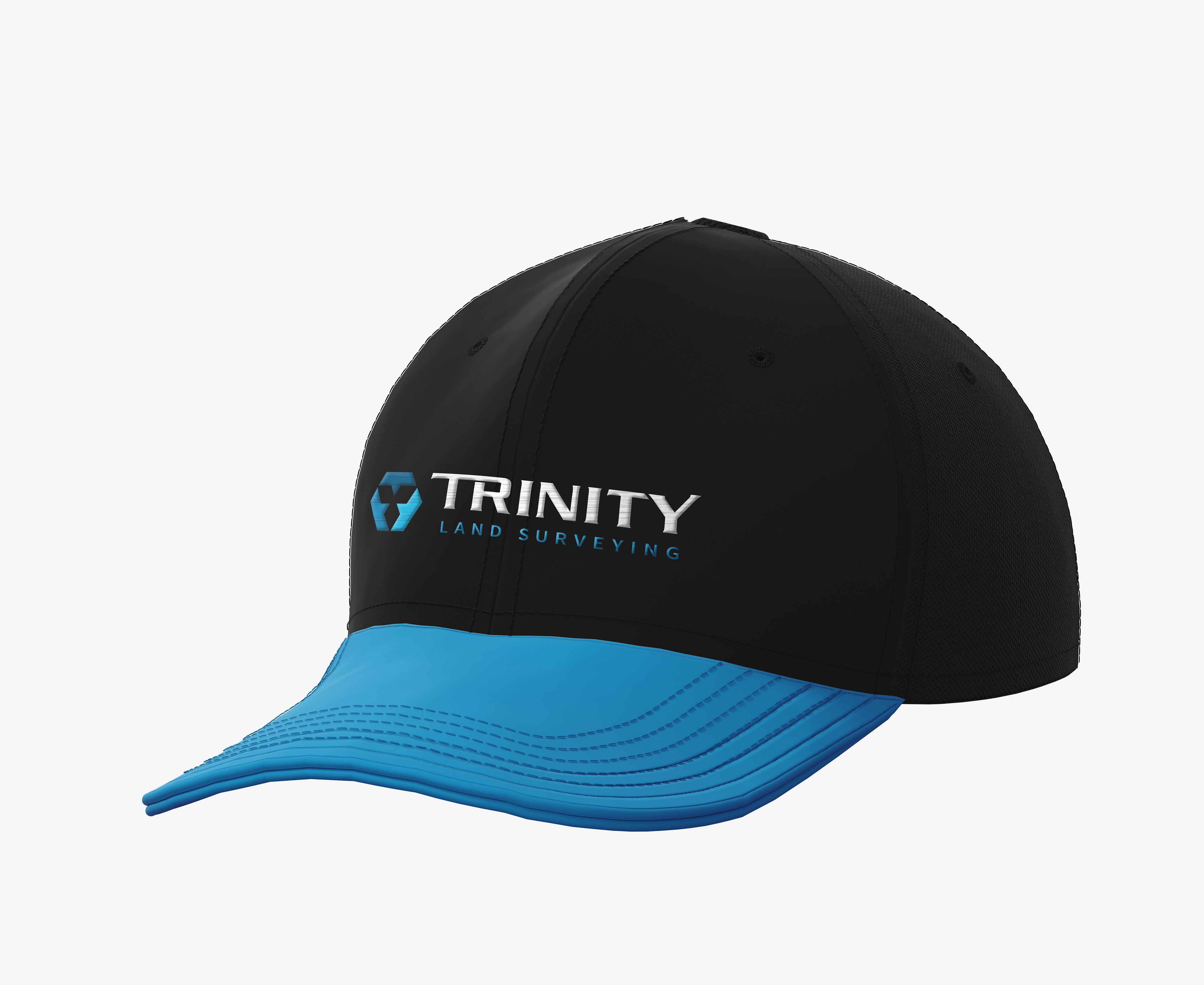
In early 2023, we had the honor of working with Land Surveyor, Michael Black, as he positioned his company, Trinity Land Surveying for growth in the North Texas area.
The challenges he presented us with were that he needed his brand to be easily recognizable, ownable, and versatile, while helping him uphold a reputation for accuracy, hard work, and approachability. The result was a hexagonal shape that would also serve as an abstract "T" Monogram, paired with customized typography that reflects accuracy, strength and professionalism.
The challenges he presented us with were that he needed his brand to be easily recognizable, ownable, and versatile, while helping him uphold a reputation for accuracy, hard work, and approachability. The result was a hexagonal shape that would also serve as an abstract "T" Monogram, paired with customized typography that reflects accuracy, strength and professionalism.
After completing brand ID system in late Spring, Mike returned for help designing his website. The site had some basic content in place, but needed a makeover, and some cleanup in navigation.
Using the visual vocabulary developed during his ID exploration allowed us to add some more visuals and improve the experience for ease of use. Now that this system is in place, Trinity's client base will have little trouble knowing what sets them apart in the competitive field of surveying and land services.


