
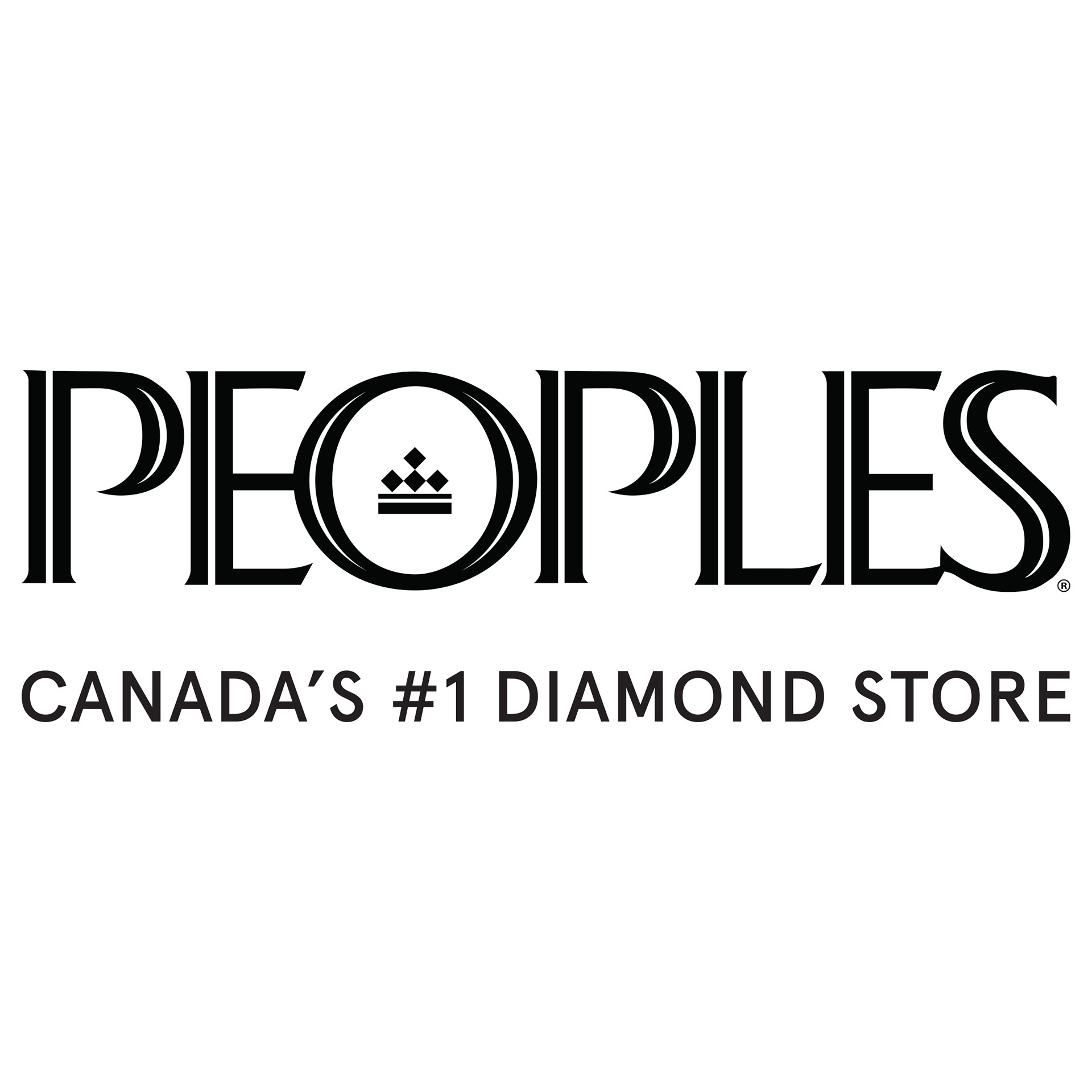
BEFORE
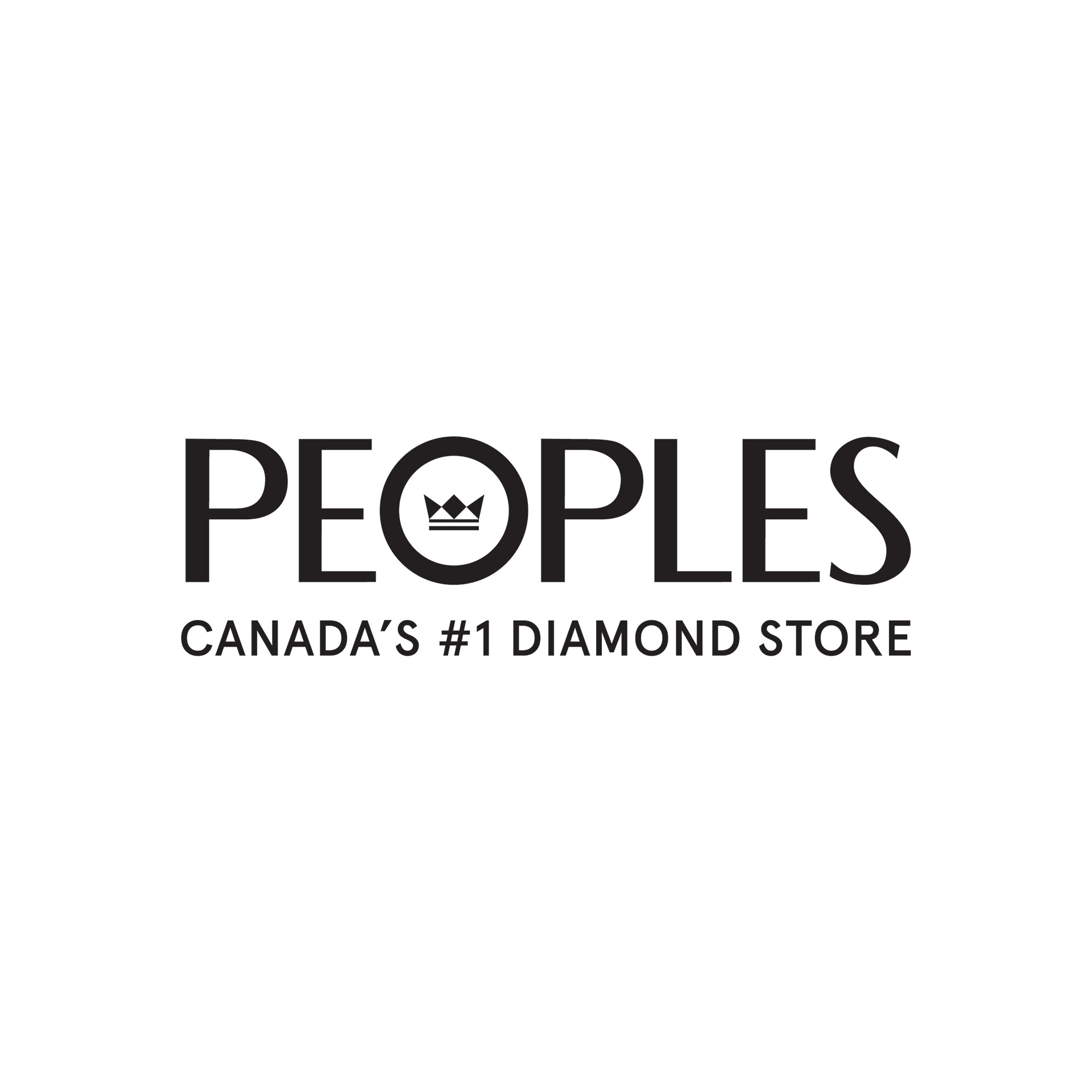
AFTER
I had the good fortune to be selected to pitch a logo refresh to the VP of Creative, VP of Marketing, and several Director-Level leaders, within the Signet Jewelers organization.
After working with the Peoples store brand for years, I was well acquainted with the challenges of the existing logo, knew the brand proposition well, and was informed of some logistical needs to address, that could help us make a strong case to the C-Suite when the opportunity was afforded.
After working with the Peoples store brand for years, I was well acquainted with the challenges of the existing logo, knew the brand proposition well, and was informed of some logistical needs to address, that could help us make a strong case to the C-Suite when the opportunity was afforded.
After conducting significant research into the brand's 105-year history, the competitive landscape, and studying the future needs of the market, We were able to make a strong case for reimagining the wordmark. Given the brand equity, the capital expenses, and the numerous departments involved in such a change, we knew it would be a big ask. But we also knew that the existing mark had been in play for over 23 years, and that the retail space had endured a number of changes in that time.


The new mark would need to be memorable and digital friendly. We knew that the logo should be visible at small sizes, such as on mobile sites, and that the icon should be able to stand on its own, as a profile pic for social media. The mark would also need uphold the brand history, while ushering it into a digital landscape.
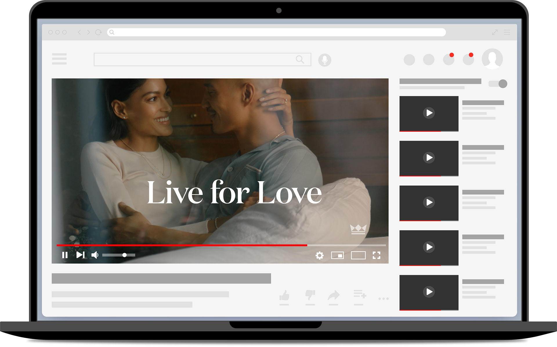
By pulling from historical ads and signage, the wordmark was built using bespoke letterforms that would give a nod to the past while being firmly rooted in the future.
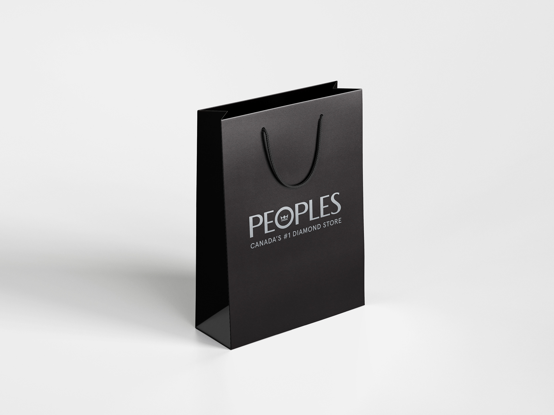
As for the logomark, we held to the "less is more" approach, in regards to change. With an organization as large as ours, we wanted to hit the target of memorability and novelty, without losing any existing brand recognition. It was a difficult balance, but the presentation was ultimately well-received.
As for the logomark, we held to the "less is more" approach, in regards to change. With an organization as large as ours, we wanted to hit the target of memorability and novelty, without losing any existing brand recognition. It was a difficult balance, but the presentation was ultimately well-received.