BEFORE
AFTER
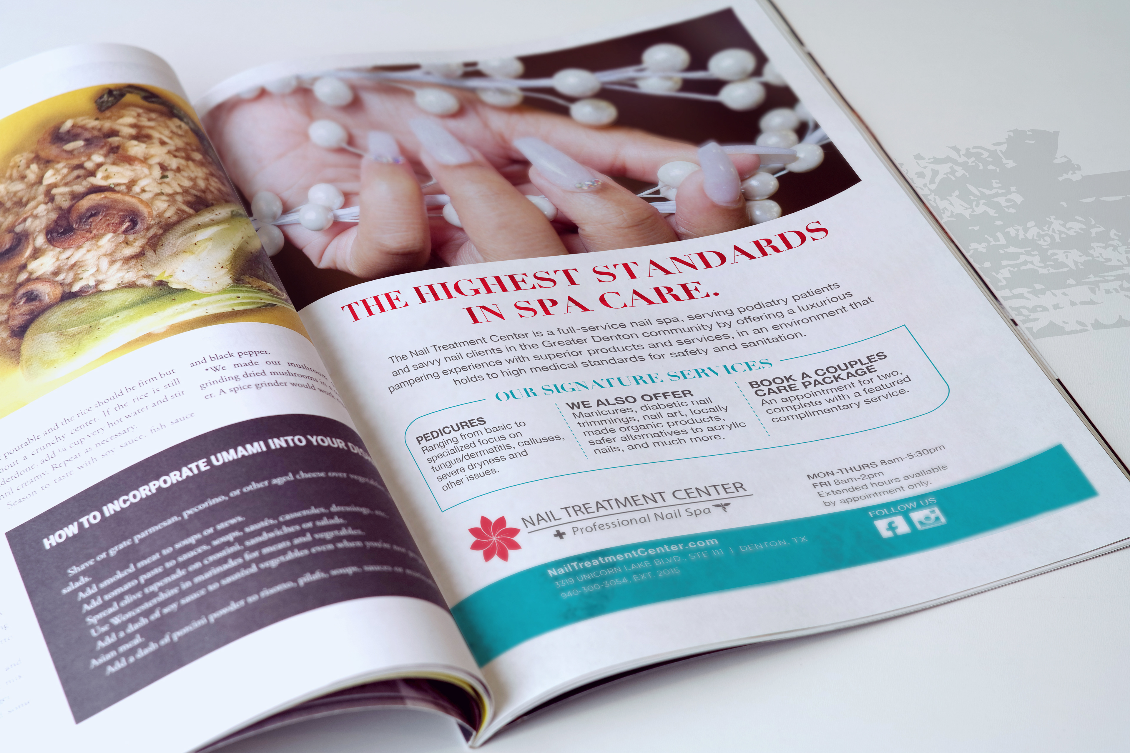
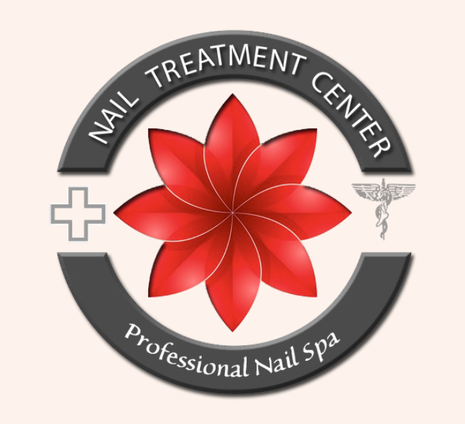
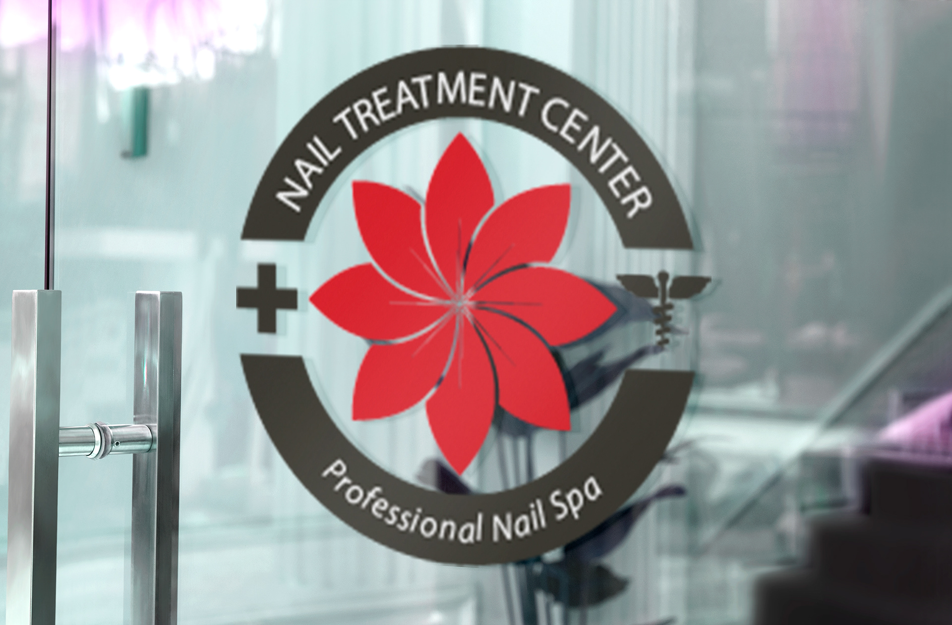
When we started working together, Nail Treatment Center had a logo, and a vision of providing quality nail services within a safe, clinical environment.
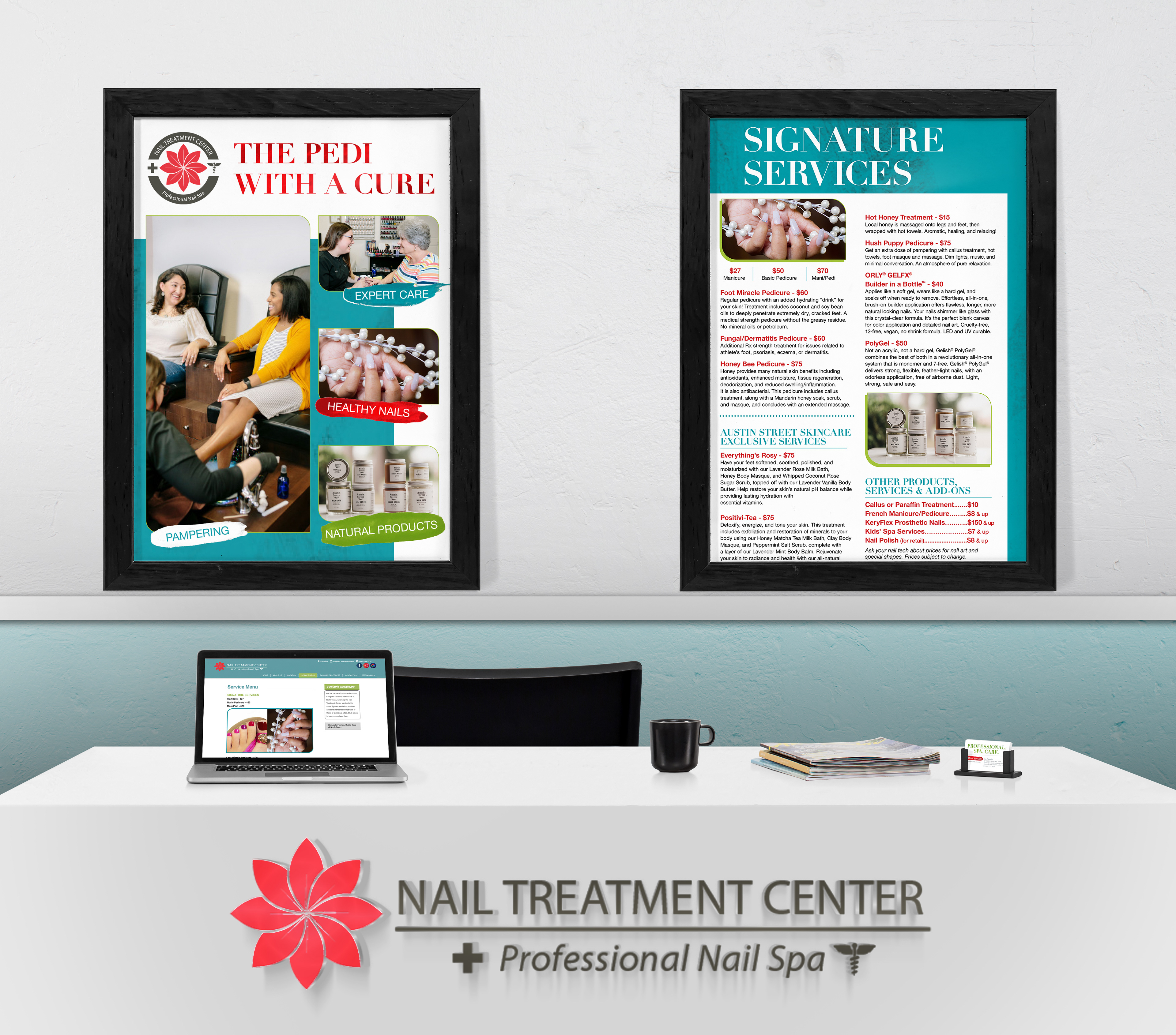
However, this vision was not coming across to their client base. After several discussions and research, we were able to identify their core values as: pampering, safety, and artistry.
However, this vision was not coming across to their client base. After several discussions and research, we were able to identify their core values as: pampering, safety, and artistry.
Agency: Reinecke Design
Client: Nail Treatment Center
Brand Strategy: Chris Reinecke
Creative Direction: Chris Reinecke
Copywriting: Chris Reinecke, Katina Butler
Photography: Client Provided
Client: Nail Treatment Center
Brand Strategy: Chris Reinecke
Creative Direction: Chris Reinecke
Copywriting: Chris Reinecke, Katina Butler
Photography: Client Provided
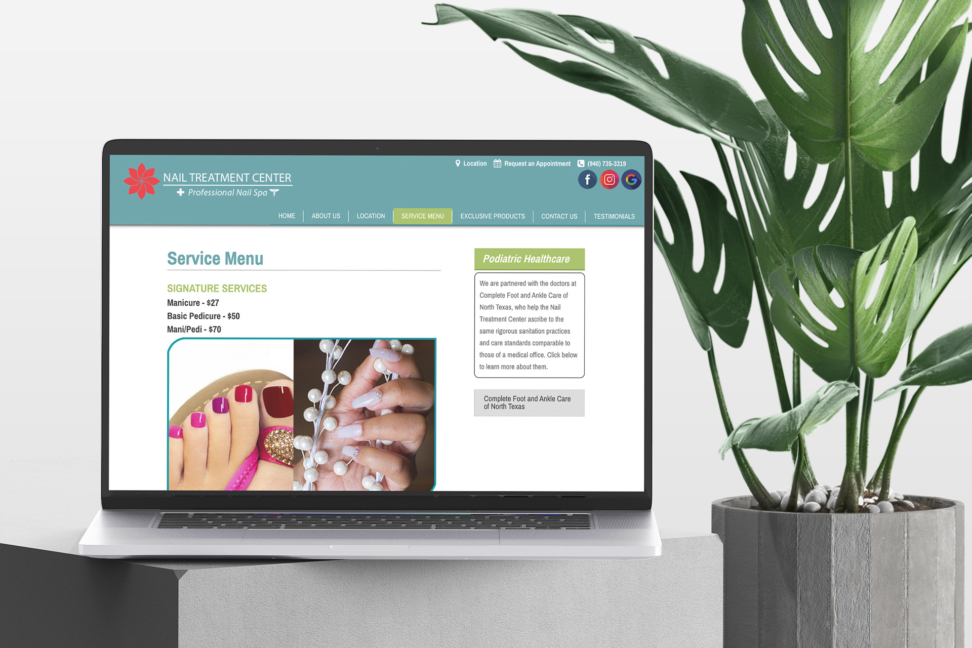
From this, we developed a system of visual guidelines to help them communicate clearly and consistently. We made some minor changes to the logo to align with industry best practices, established a written tone of voice, and selected the color palette and typefaces that would represent the brand.
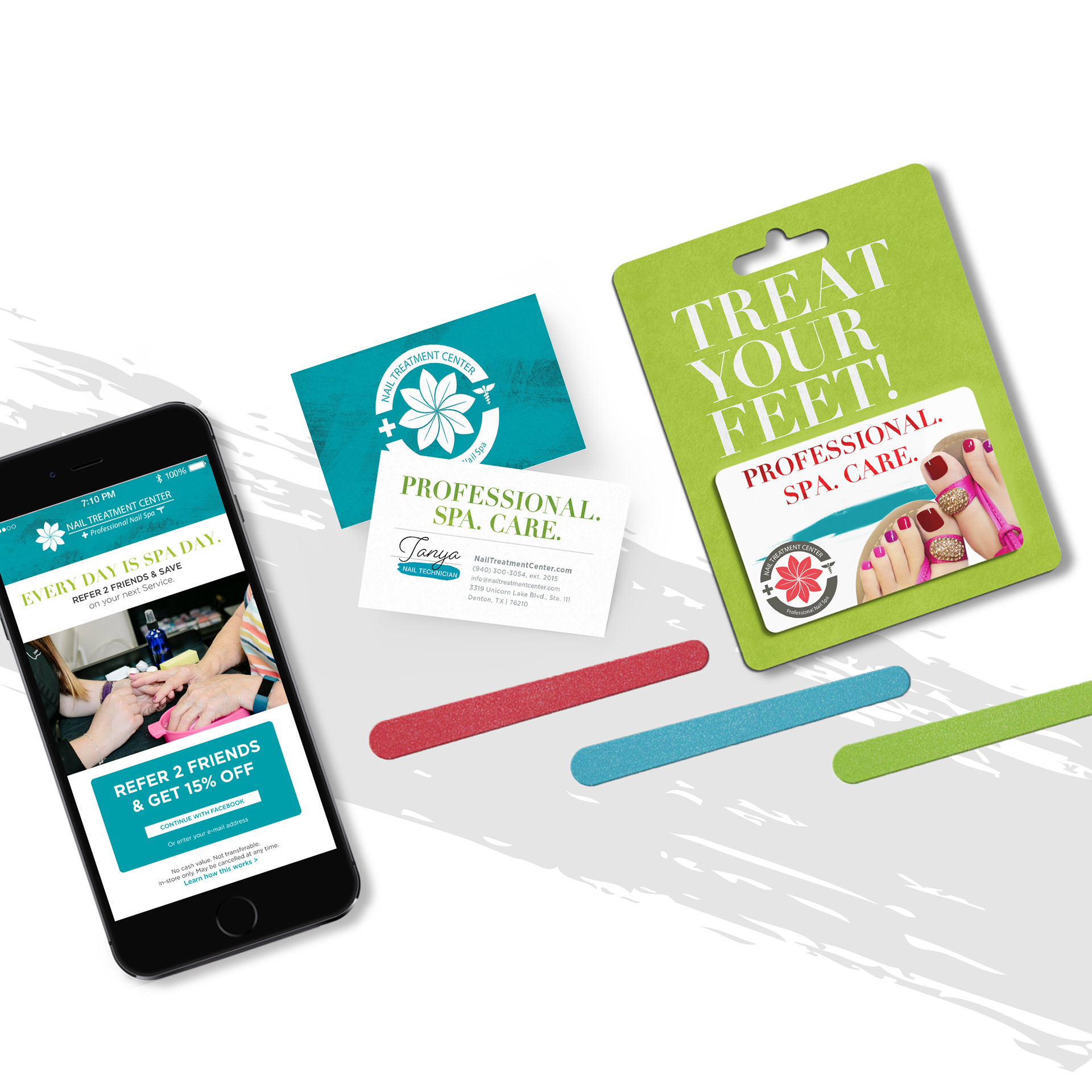
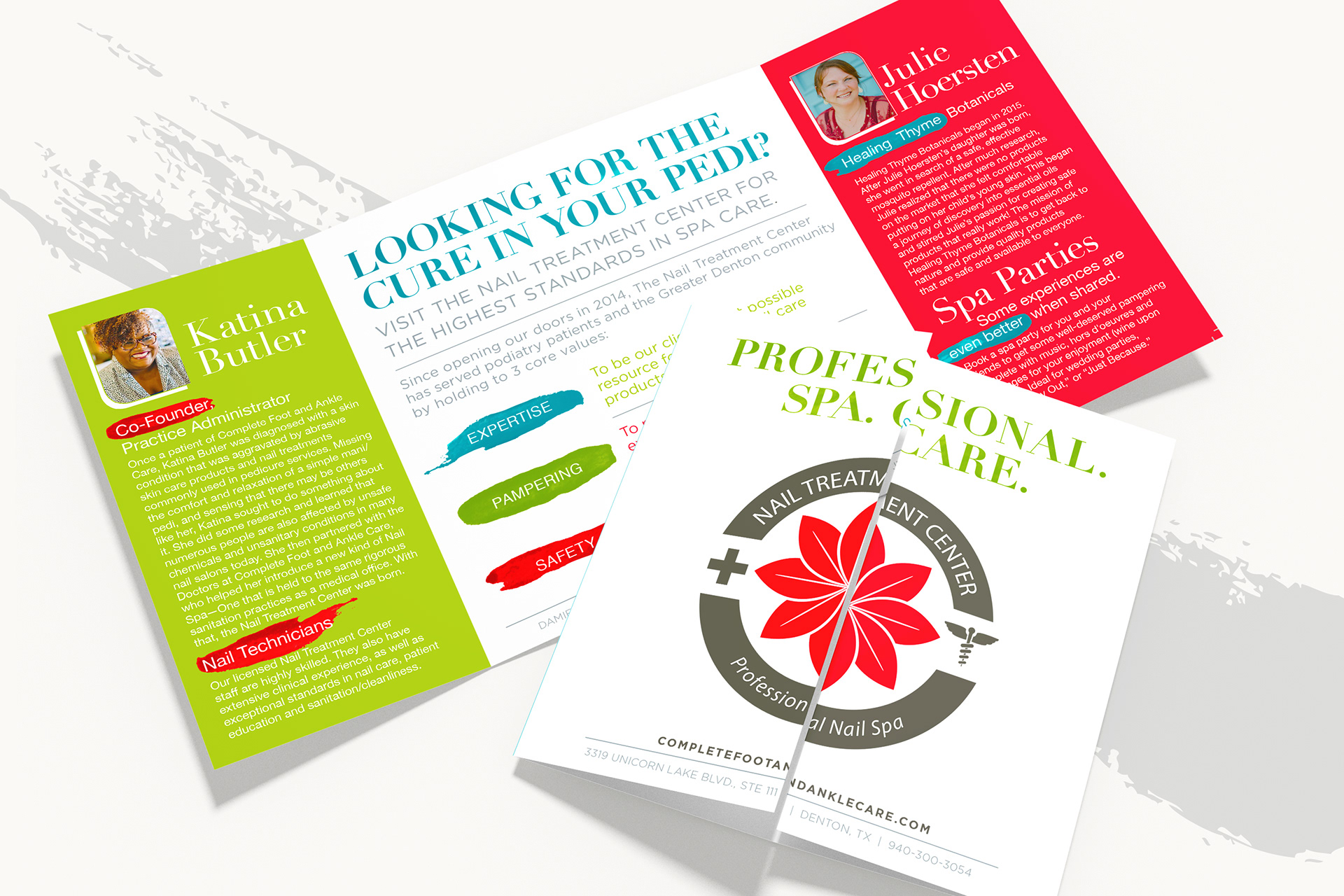
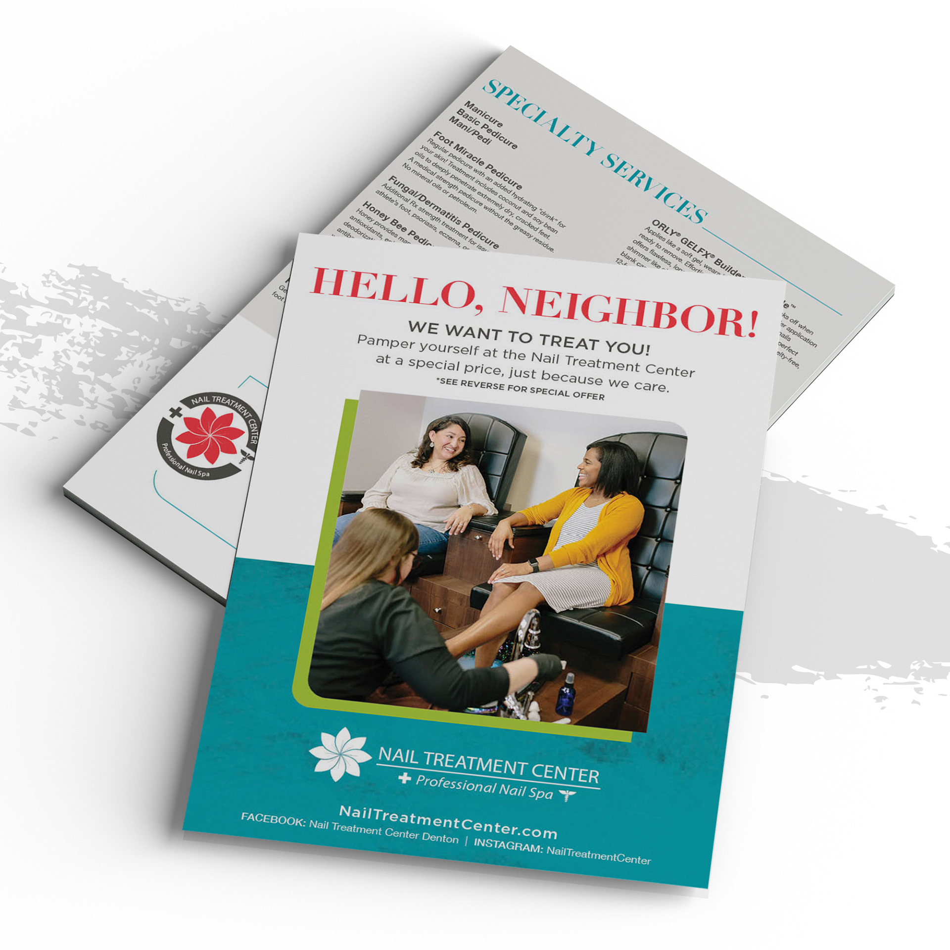
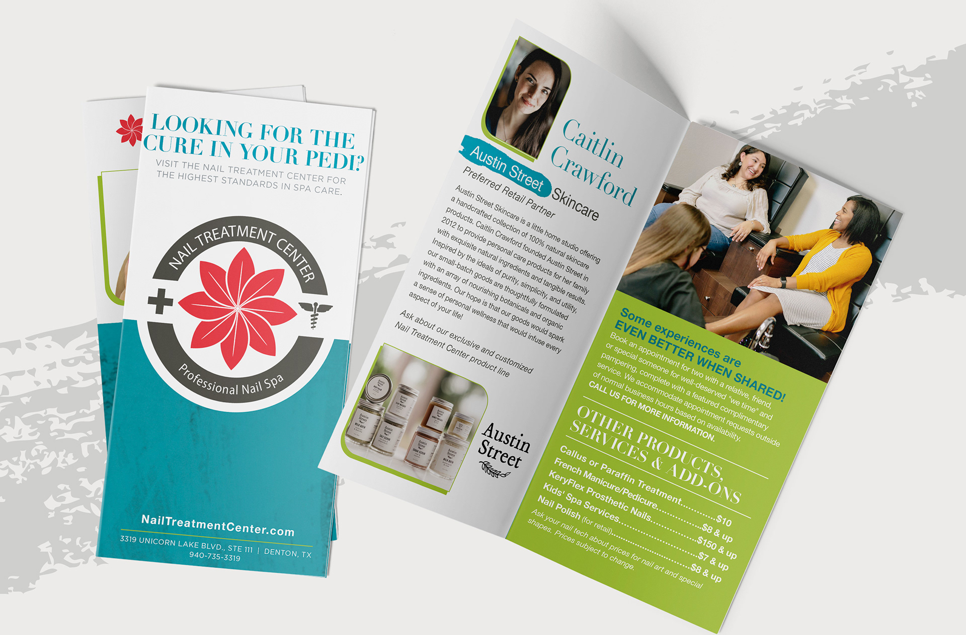
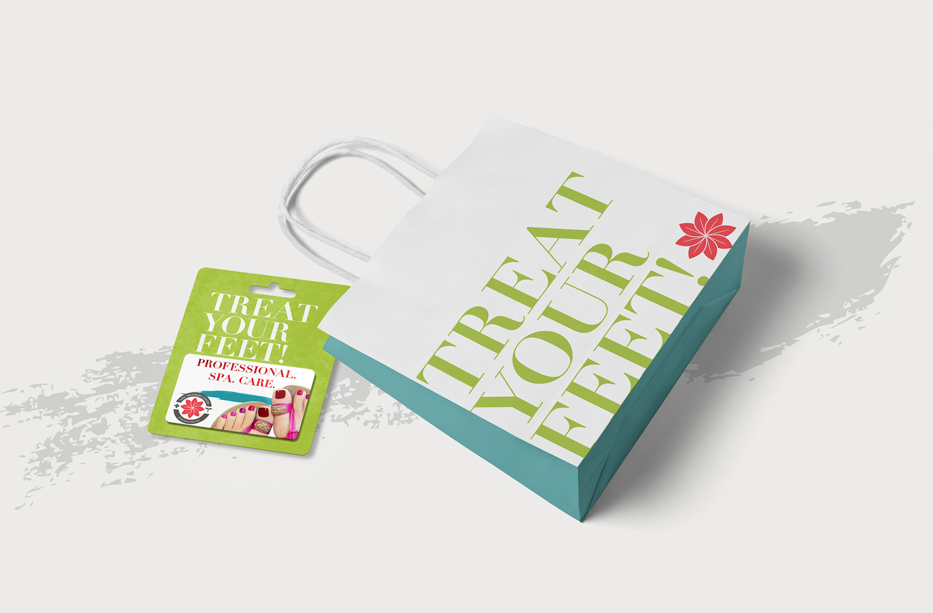
Today, after applying this system to over 40 print pieces, a website, and several digital assets for social delivery, they have consistent visuals that make their message and purpose clear for all.