The multiple award-winning brand design we created for Kim Ward Photography began with a simple request:
To redesign the logo with a simplified, modern approach, and to build the brand ethos around a changing market.
Instead of focusing solely on family portraits, the owner wanted to accommodate her growing commercial clientele, shooting home interiors.
Agency: Reinecke Design
Client: Kim Ward Photography
Creative Direction: Chris Reinecke
Designer: Chris Reinecke
Brand Strategy: Chris Reinecke
Photography: Kim Ward
Client: Kim Ward Photography
Creative Direction: Chris Reinecke
Designer: Chris Reinecke
Brand Strategy: Chris Reinecke
Photography: Kim Ward
The solution: Pair the simplified logo with a brand language that is at the same time architectural and creative, and speaks to photography.
The overlapping frame pattern was created from the concept of a viewfinder- an exercise sometimes employed by photographers by intersecting 2 frames, to get a feel tor how an image will crop.
The overlapping frame pattern was created from the concept of a viewfinder- an exercise sometimes employed by photographers by intersecting 2 frames, to get a feel tor how an image will crop.
The color palette was carefully selected based on the core values of the business, with an emphasis on creativity, and confidence.
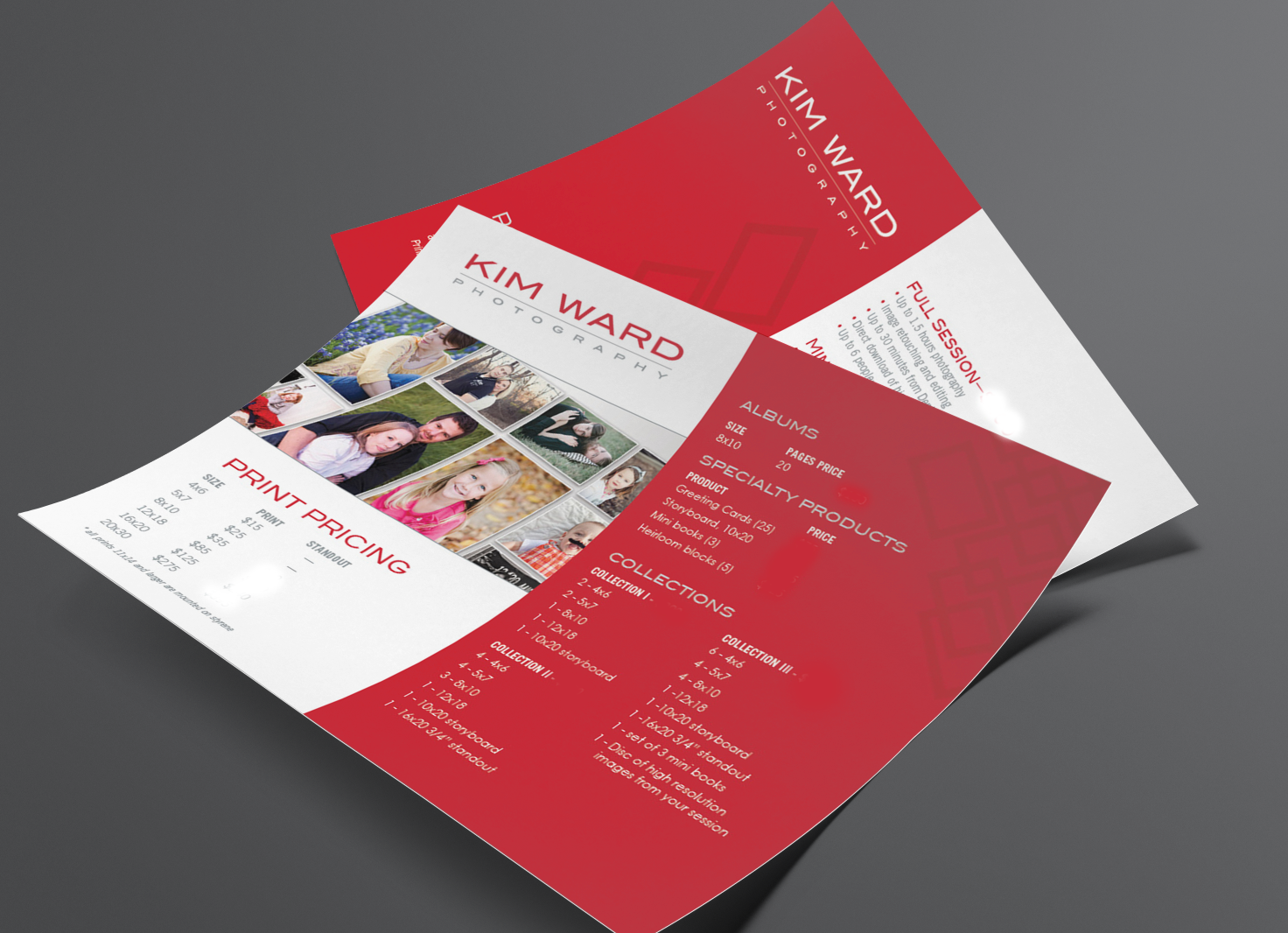
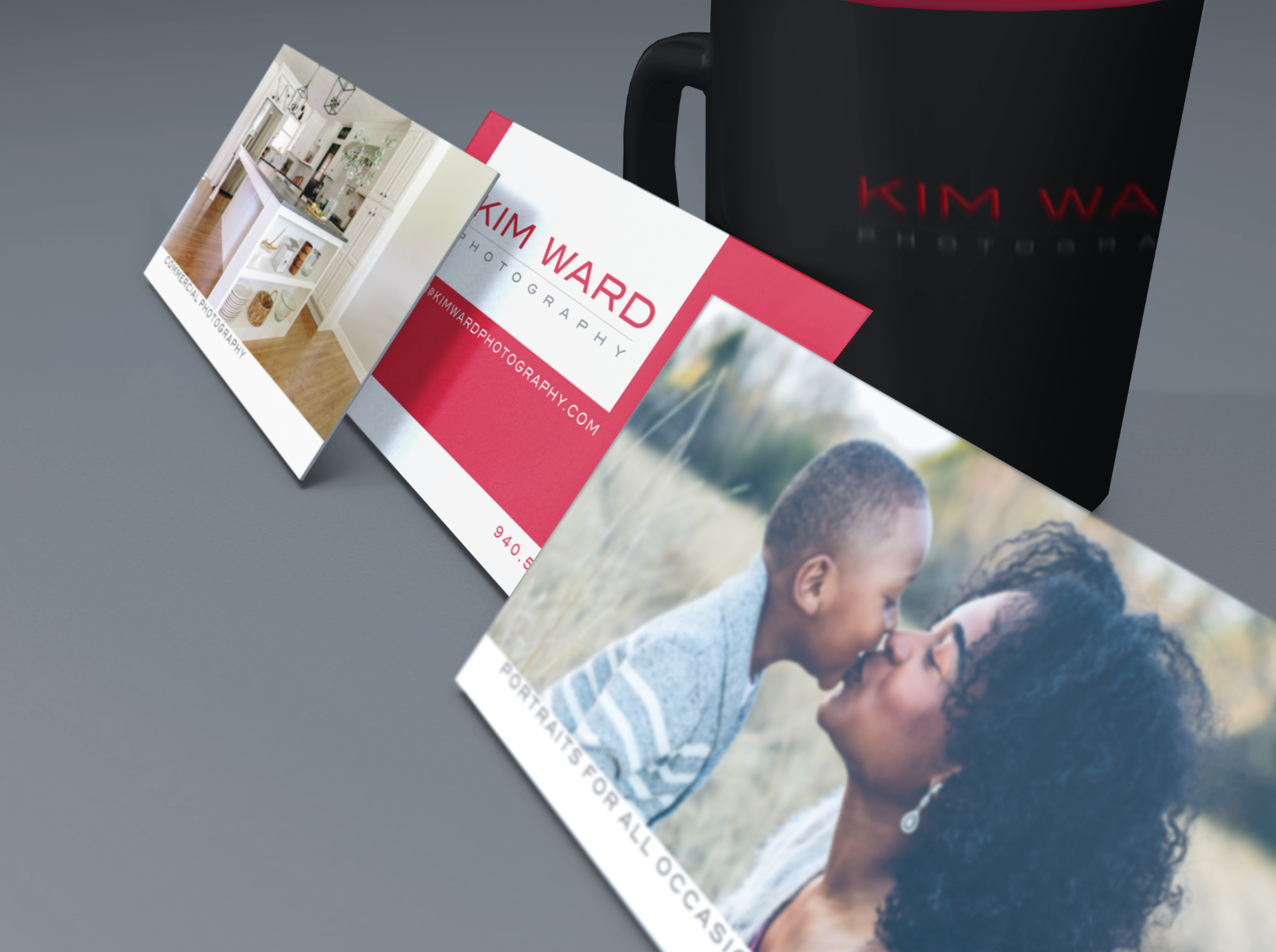
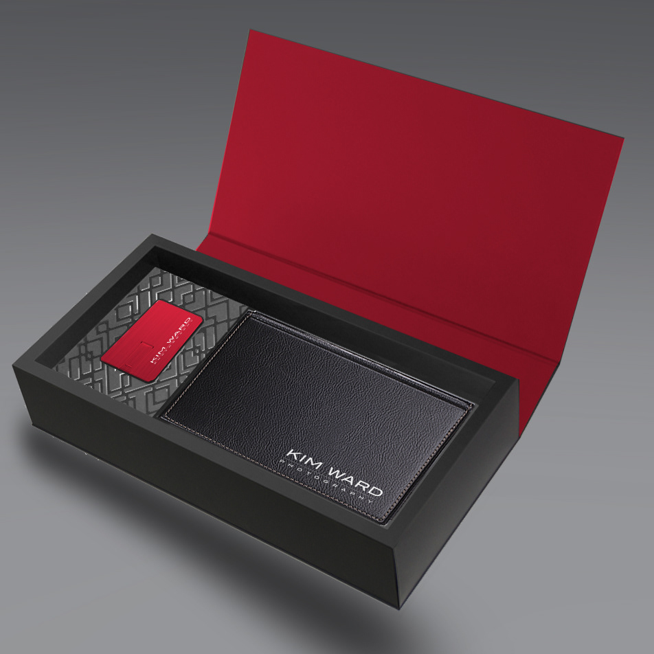
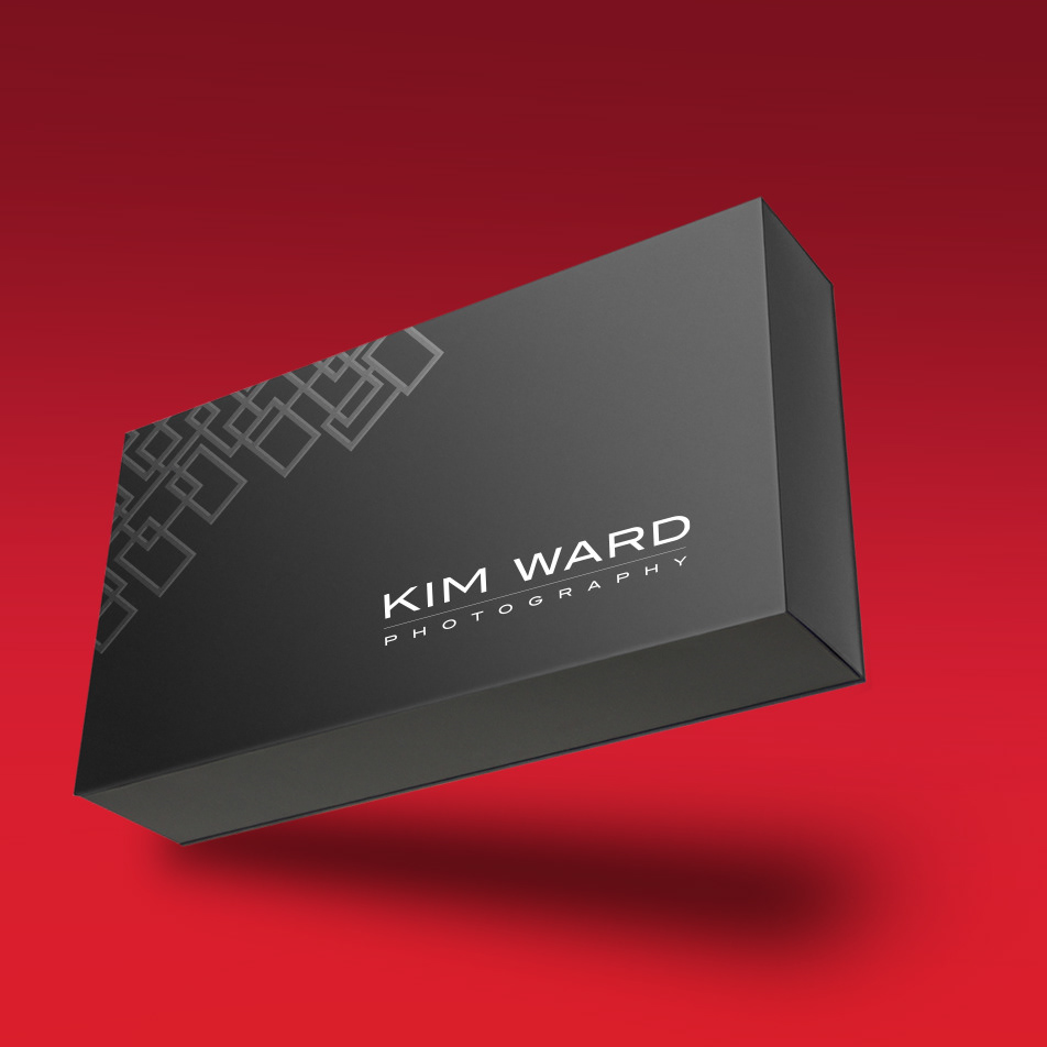

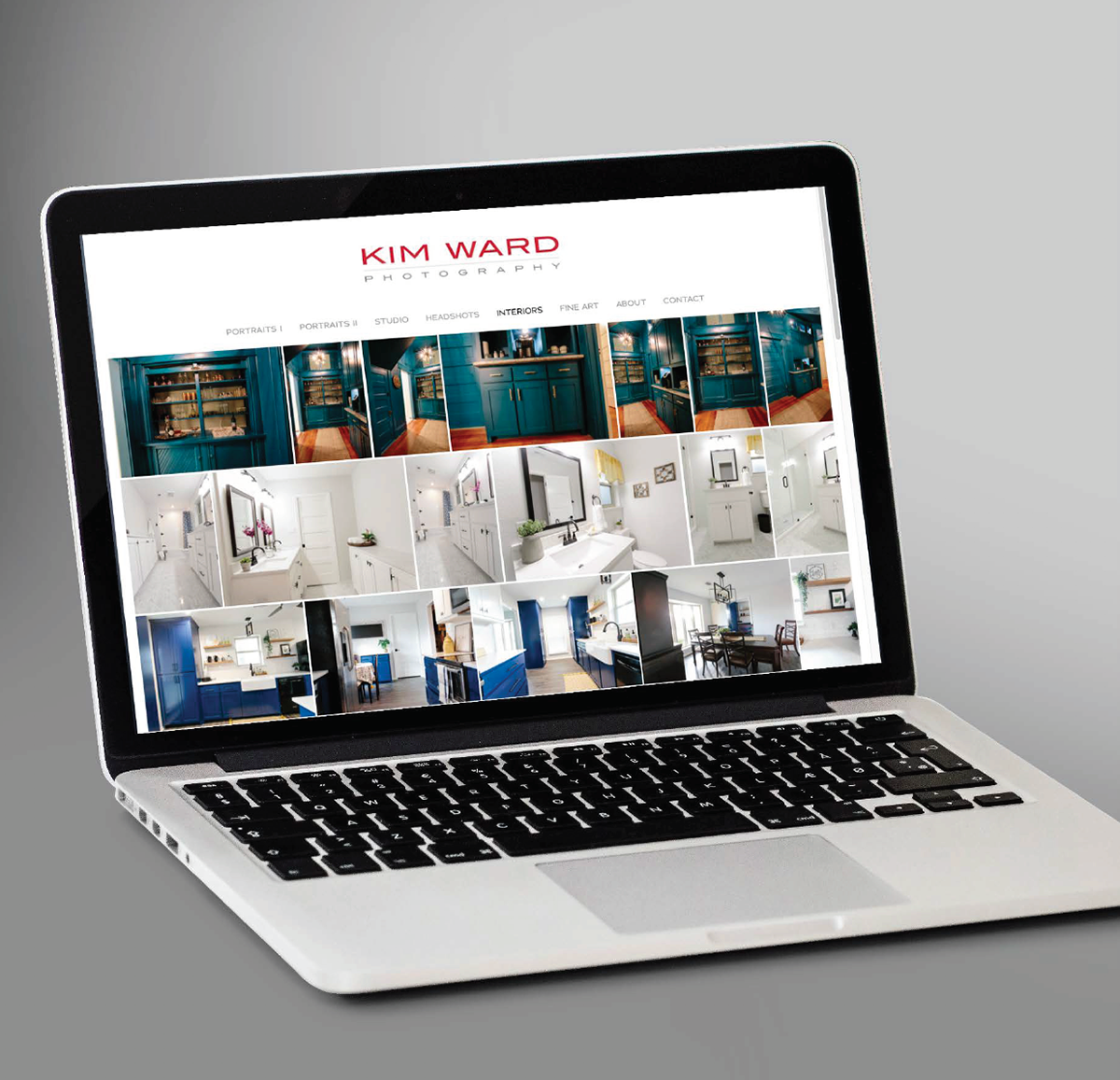

The Reinecke Design process of designing with purpose, on purpose, meant that we labored over every decision until we were convinced it was right for our client—And it shows at every touchpoint from stationery to packaging, to gift cards and digital media.
