
BEFORE
AFTER
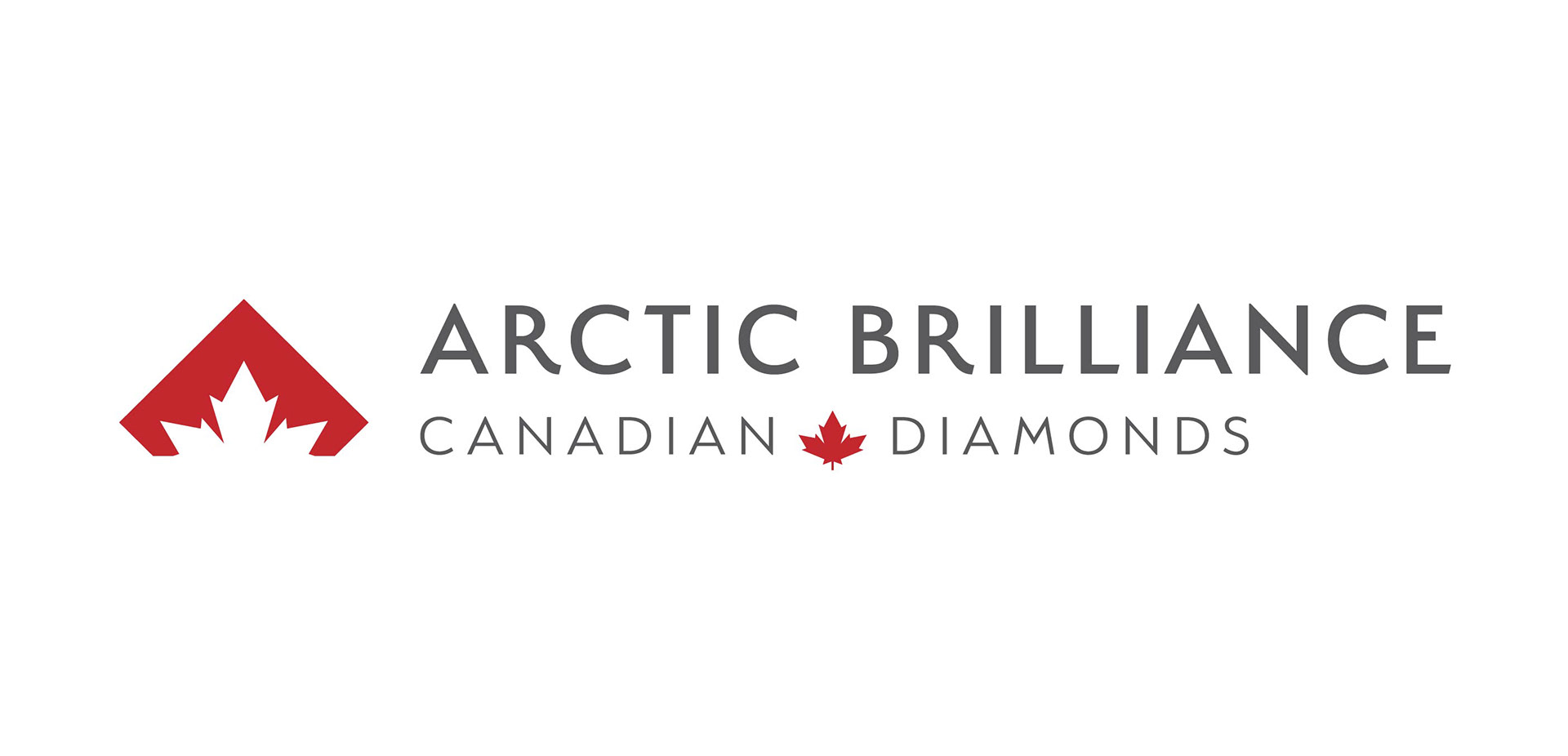
In 2020 I was tasked with the creation of a new logo for a line of Canadian Diamond Jewellery. The product's claim was clean mining and ethical sourcing from Arctic glaciers to produce diamonds with unsurpassed clarity.
In gemology, the facets (or cut) of a diamond contributes to the stone's overall brilliance, so the logomark incorporates a maple leaf in the negative space of a diamond, to form facets.
In gemology, the facets (or cut) of a diamond contributes to the stone's overall brilliance, so the logomark incorporates a maple leaf in the negative space of a diamond, to form facets.
Copy: Tracy Tapscott and Susan League
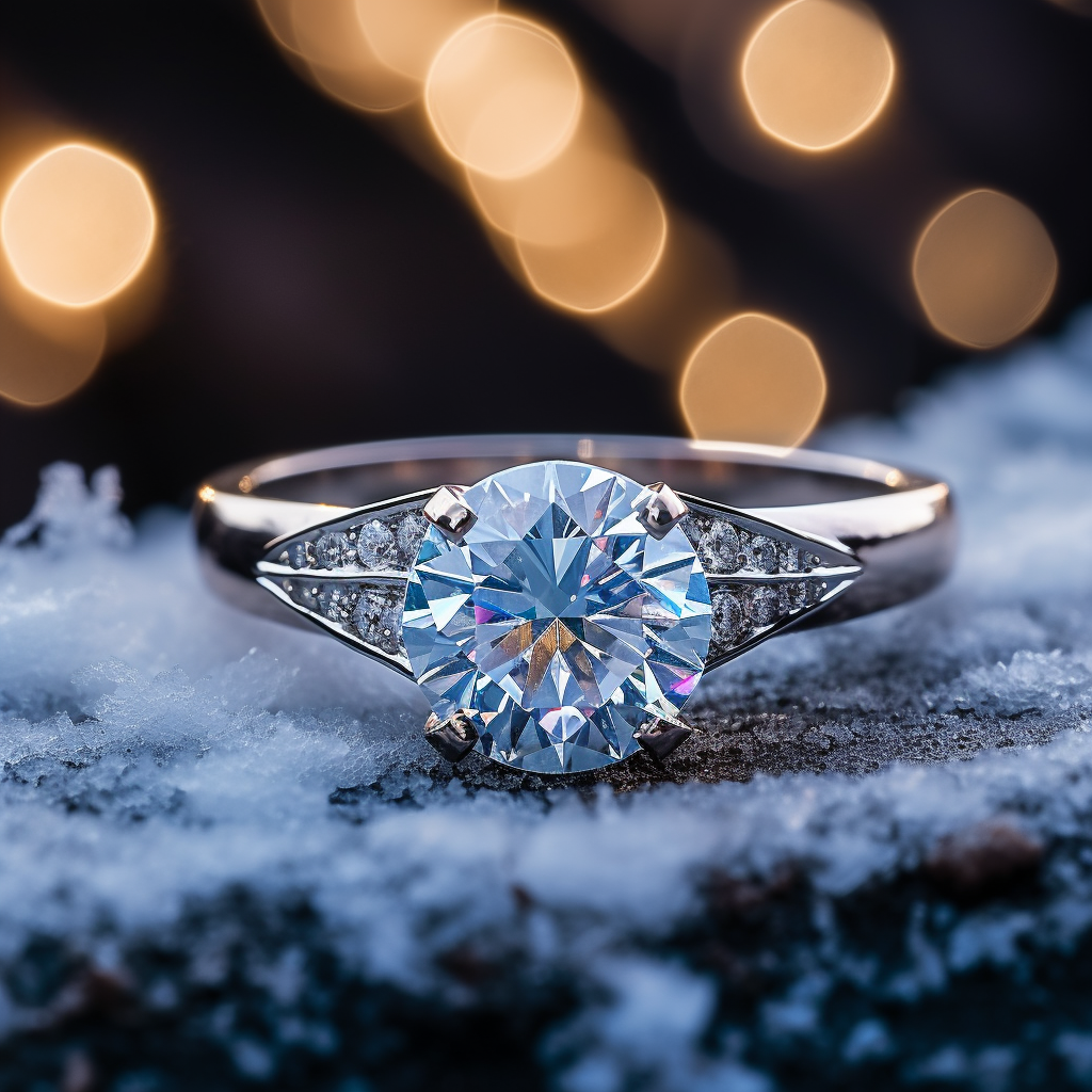
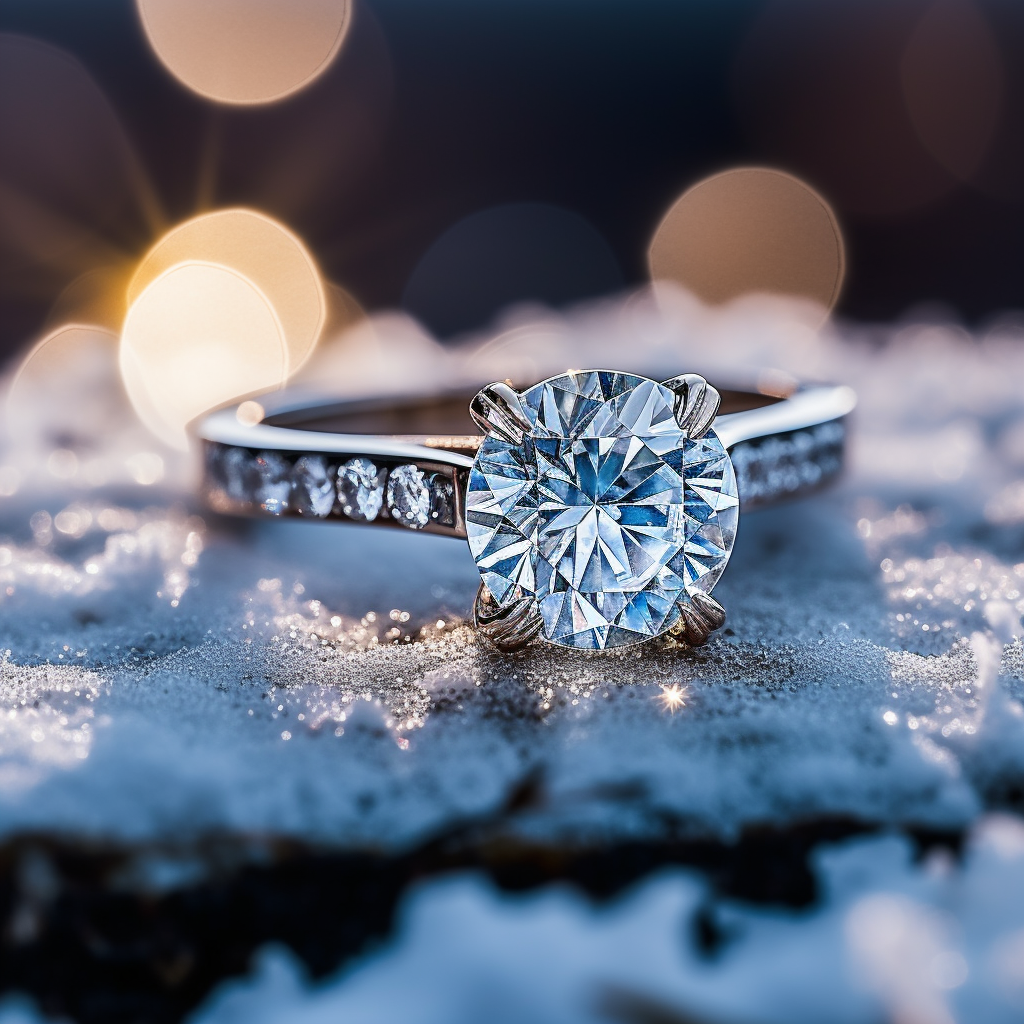
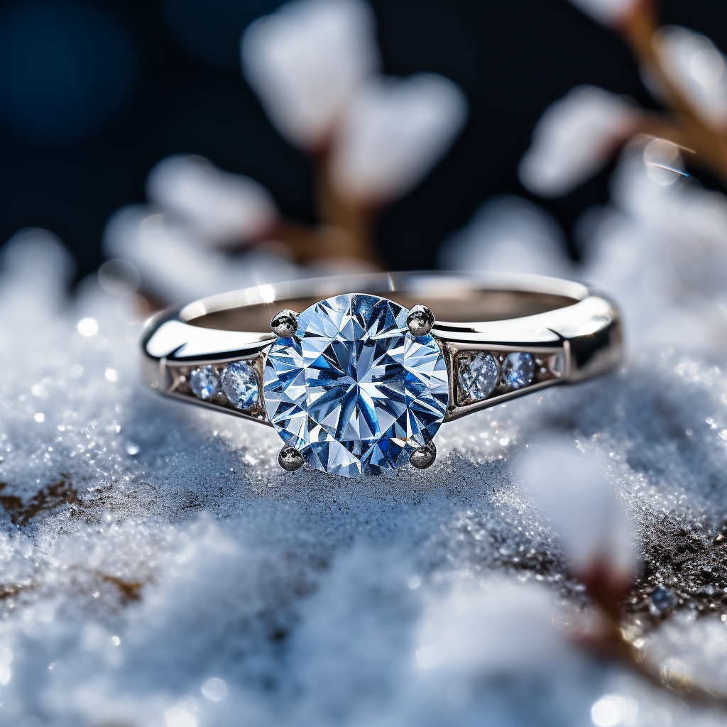
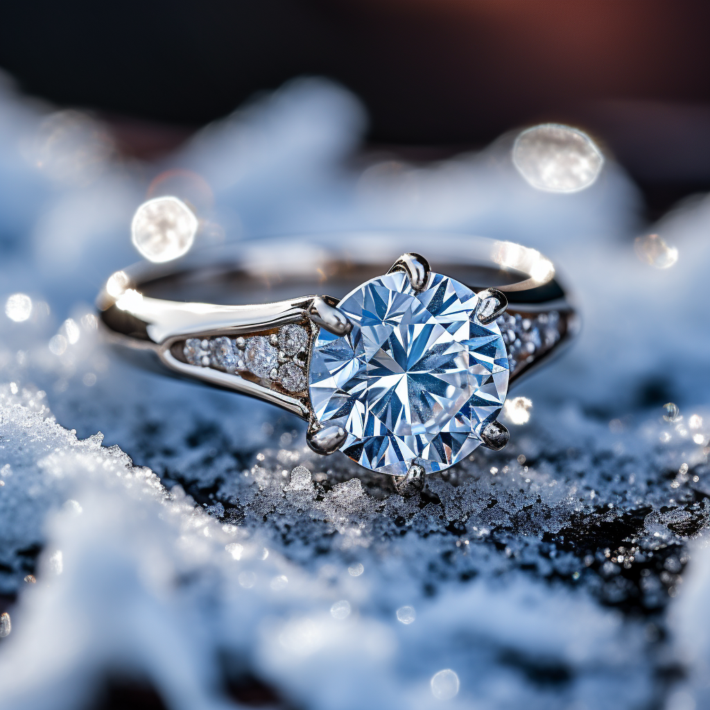
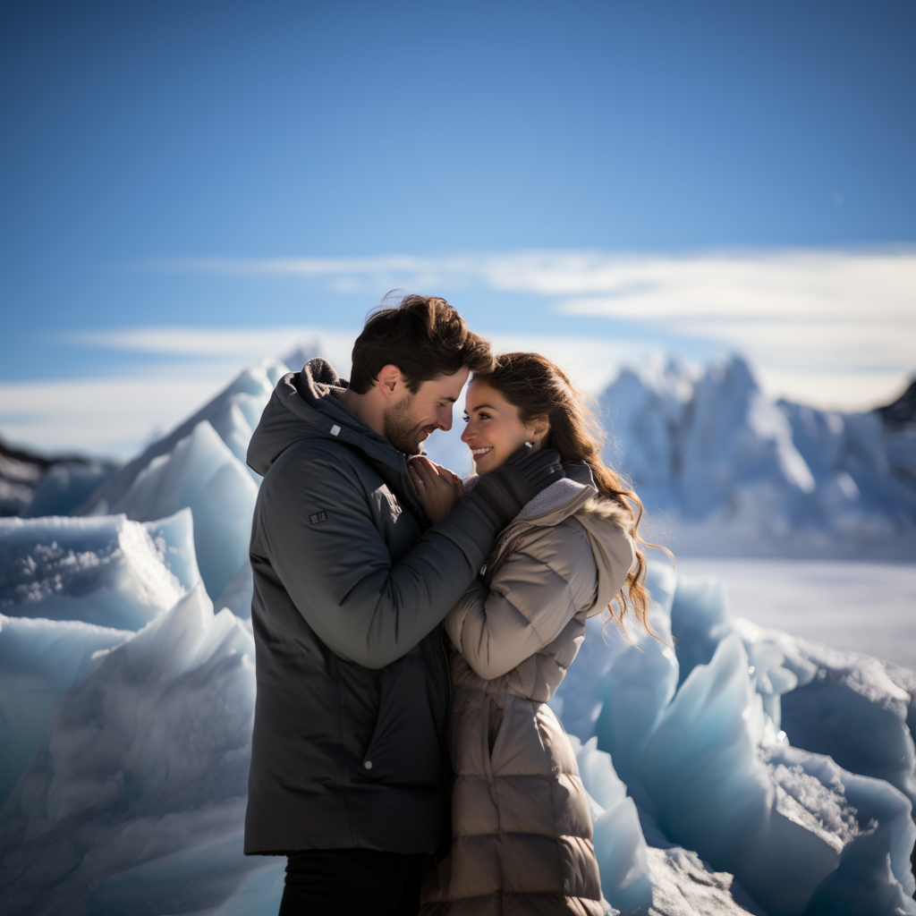
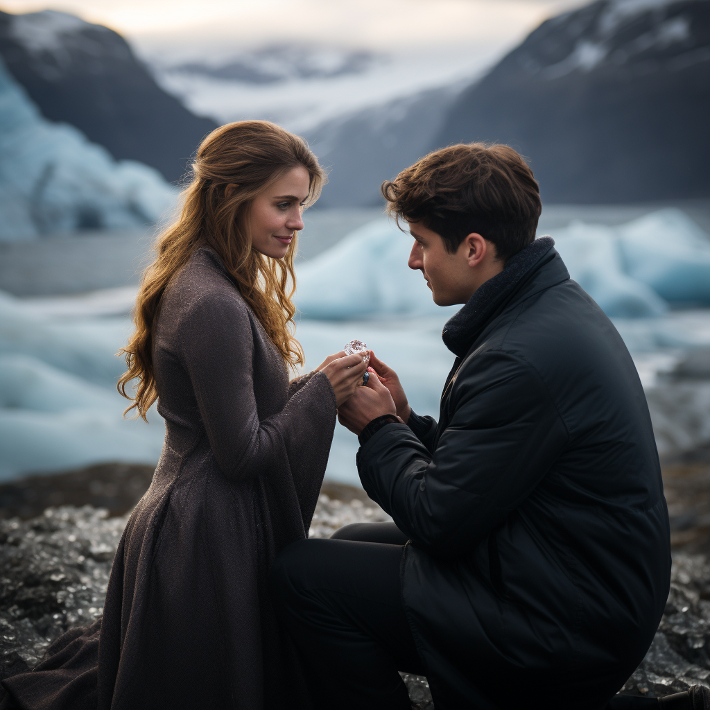
Photography: Generated from MidJourney
Photography: Generated from MidJourney
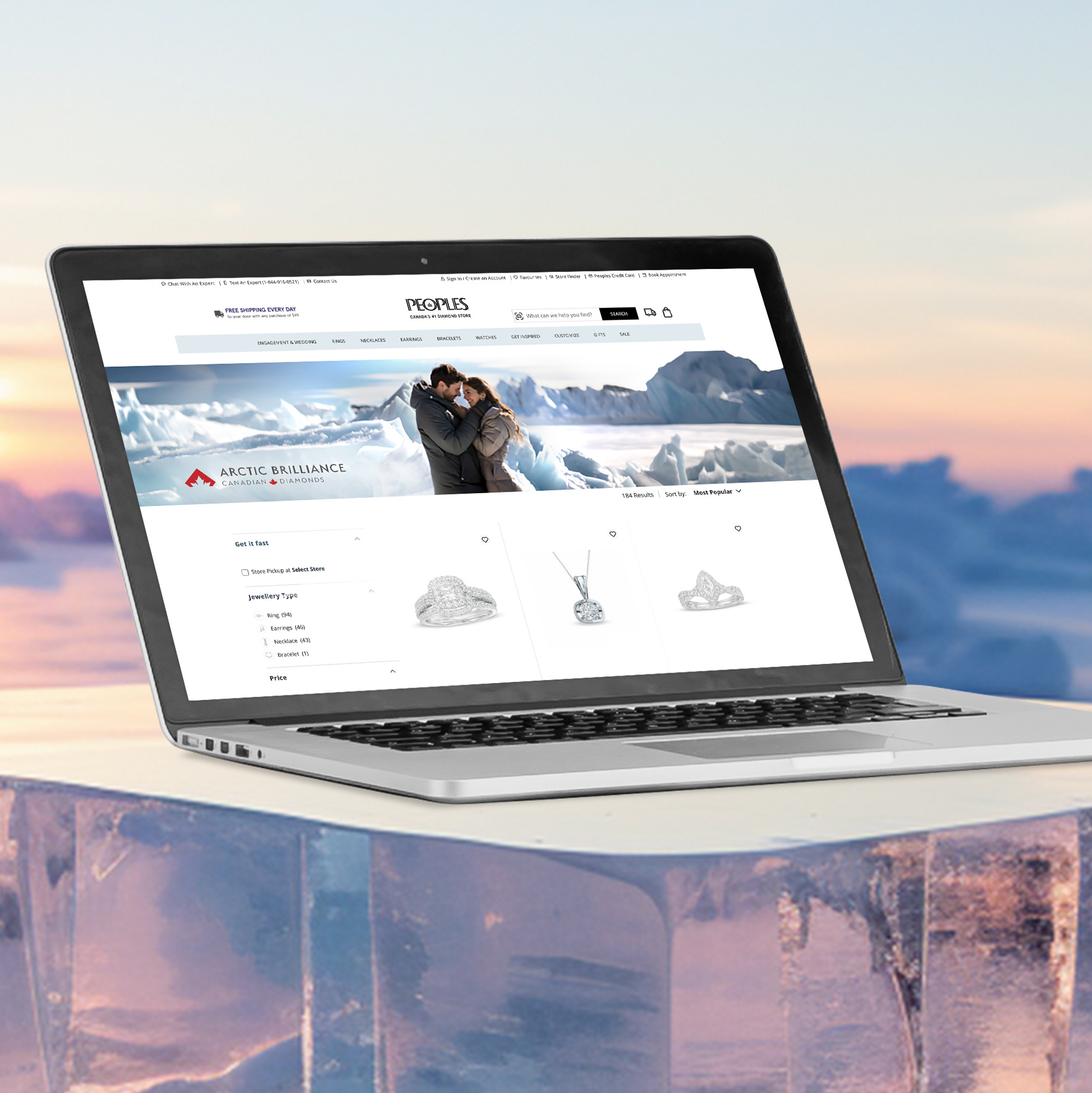
After the logo was in place for a while, there were very few assets in place to support the brand.
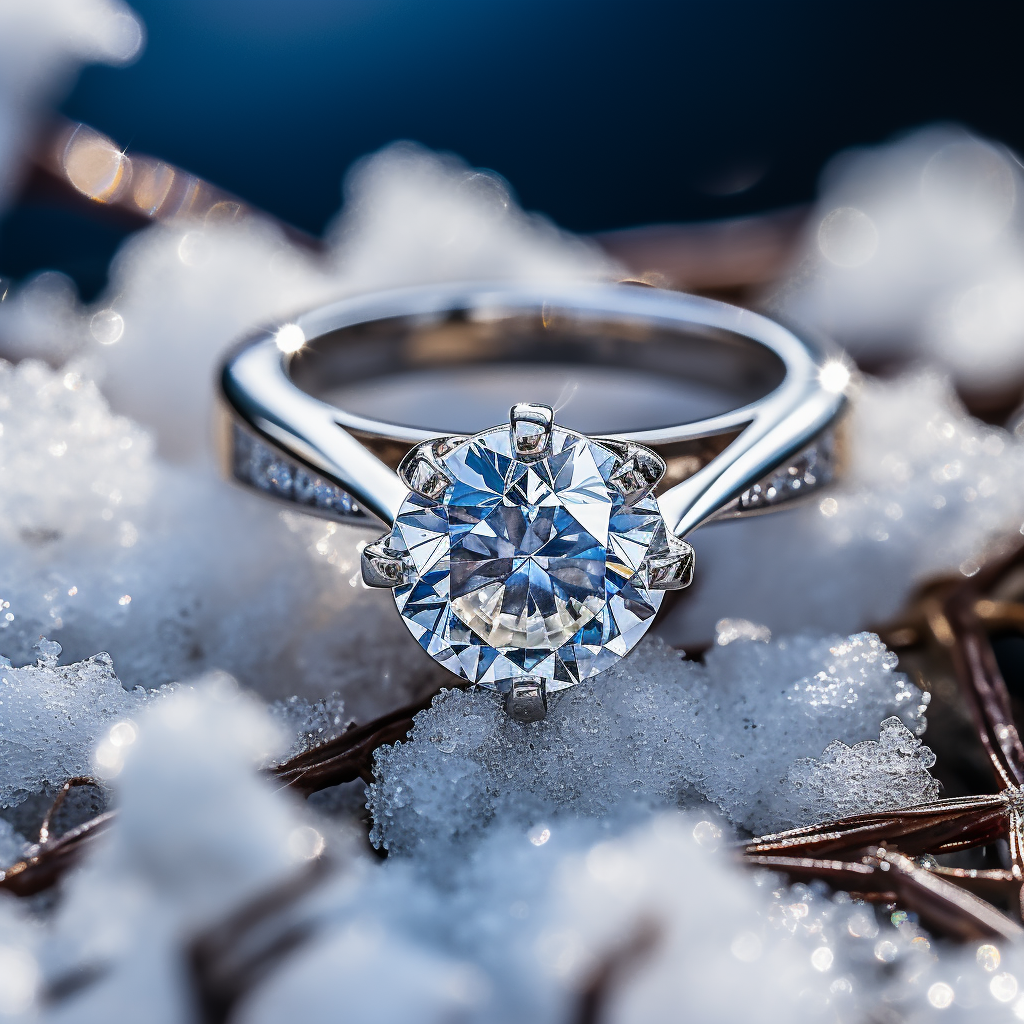
These lifestyle and product images were created using MidJourney, as swipes for a proposed photoshoot,
that would help sell the story of Arctic Brilliance Canadian Diamonds.
These lifestyle and product images were created using MidJourney, as swipes for a proposed photoshoot,
that would help sell the story of Arctic Brilliance Canadian Diamonds.